Bulk-generate & schedule posts in seconds with Smart Scheduling. Try now!
Brand identity: Complete guide to building a memorable brand
Look, your brand identity is basically your business putting on clothes and walking out the door. It’s how you show up to the party, and trust us, everyone’s at this party. With thousands of brands screaming for attention every single day, you can’t afford to be the person who shows up in sweatpants when everyone else brought their A-game.
Building a brand identity feels overwhelming, but really it’s not. What you really need is clarity on who you are, what you stand for, and how you want people to feel when they interact with your brand. Everything else is just execution.
We’ll walk you through all these steps starting from the very basics.
What is brand identity?
Brand identity is how your business presents itself to the world visually. It includes all the design elements that make your brand recognizable by working together to create a consistent experience. When someone scrolls through Instagram or walks past your storefront, your brand identity is doing the talking before you say a word.
The brand identity definition is pretty straightforward: it’s the collection of visual elements that represent your business. Your logo, color palette, typography, imagery style, and graphic elements, all working together to create something people can instantly recognize.
This is different from your brand personality (that’s how you act and talk) or your overall branding (that’s everything combined). Brand identity is specifically about the visual components that make you identifiable in a crowded marketplace.
When McDonald’s golden arches pop up on a highway sign, you know exactly what you’re getting before reading a single word. That’s brand identity working perfectly.
Why is brand identity important?
Your brand identity is doing heavy lifting 24/7, even when you’re sleeping. Here’s why it’s important to get it right:
Recognition happens faster
People’s brains process visual information crazy fast, and they make decisions about brands in milliseconds. A strong brand identity creates instant recognition, which is the first step toward trust. And trust leads to sales, which leads to you being able to afford more than ramen for dinner.
Also Read: How to win with sales & social media partnerships for your brand?
Premium pricing becomes possible
Ever wonder why people pay $5 for Starbucks coffee when 7-Eleven coffee costs $1? When your visual identity exudes quality and attention to detail, customers assume your product does too. Brand identity creates this perceived value beyond just features and benefits.
Customer loyalty grows stronger
When people can easily identify your brand, they start developing preferences. They’ll scroll past competitors to find your stuff, defend you in comment sections, and recommend you to friends.
Also Read: How to build a better brand reputation with reviews?
Marketing becomes easier
Your brand identity provides the playbook that tells your team (or just you wearing different hats) exactly what to create such that every social post, every ad, and really just every piece of content has clear visual guidelines.
Competition becomes irrelevant
Strong brand identities create emotional connections that price comparisons can’t break. When someone loves your brand, they won’t switch for a 10% discount.
Key elements of a brand identity
A solid visual brand identity system has six core components that work together like a perfectly coordinated fit. Each element plays a specific role, but they all need to support the same visual story.
Logo
Your logo is the face of your brand. It’s the one element people will see most often and remember longest. It doesn’t need to explain what you do or tell your entire brand story. It just needs to be distinctive, memorable, and versatile enough to work everywhere from business cards to billboards.
The best logos are surprisingly simple. Take Nike’s swoosh, Apple’s apple, or McDonald’s golden arches, for instance. None of them are complicated, but they’re instantly recognizable. Your logo should work in color and black and white, at tiny sizes and large scales, and across every platform where your brand appears.
Don’t overthink it. A good logo becomes meaningful through consistent use and positive associations with your brand, not through clever symbolism or complex design.
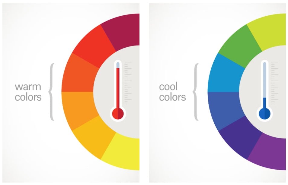
Color palette
Colors trigger emotional responses faster than any other visual element. Your color palette is often the first thing people register and the quickest way to create brand recognition.
Choose colors that align with your brand’s personality and appeal to your target audience. You might find yourself tapping into color theory a little for this. Tech companies, for instance, love blue because it suggests trust and reliability. while food brands often use red and yellow because they stimulate appetite. Similarly, beauty brands gravitate toward soft pinks and purples to convey femininity and luxury.
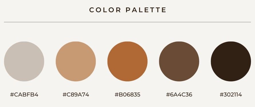
Develop a primary palette of 2-4 colors that work well together, then add secondary colors for accent use. Document the exact color codes (hex, RGB, CMYK) so your colors stay consistent across digital and print applications. Consistency is what builds recognition over time.
Typography
Your font choices communicate personality just as powerfully as your colors. Typography sets the tone for how people read and interpret your content, so choose fonts that reinforce your brand’s character.
Select a primary font for headlines and important text, plus a secondary font for body copy. Make sure both fonts are readable at different sizes and work well together visually. Clean, simple fonts usually age better than trendy ones.
Consider where your fonts will be used most often. If you’re primarily digital, prioritize web-safe fonts that load quickly. If you do a lot of print work, make sure your fonts look crisp on paper and are available for licensing.
Imagery
Your imagery style, that is, the types of photos, illustrations, or graphics you use, plays a huge role in how people perceive your brand. Consistent imagery style makes your content instantly recognizable, even without your logo.
Develop guidelines for your imagery style. Do you use bright, saturated photos or muted, natural tones? Are your images clean and minimal or busy and energetic? Do you prefer photography, illustrations, or a mix of both?
Think about Airbnb’s photography style. It’s deliberately warm, welcoming, and focused on real people in real spaces. Or consider Spotify’s duotone treatment that makes any photo feel on-brand. Consistency in imagery style is just as important as consistency in colors or fonts.
Brand graphics
These are the supporting visual elements that complement your logo, such as patterns, icons, shapes, textures, or graphic treatments that appear across your brand materials. They add visual interest and help create a cohesive look.
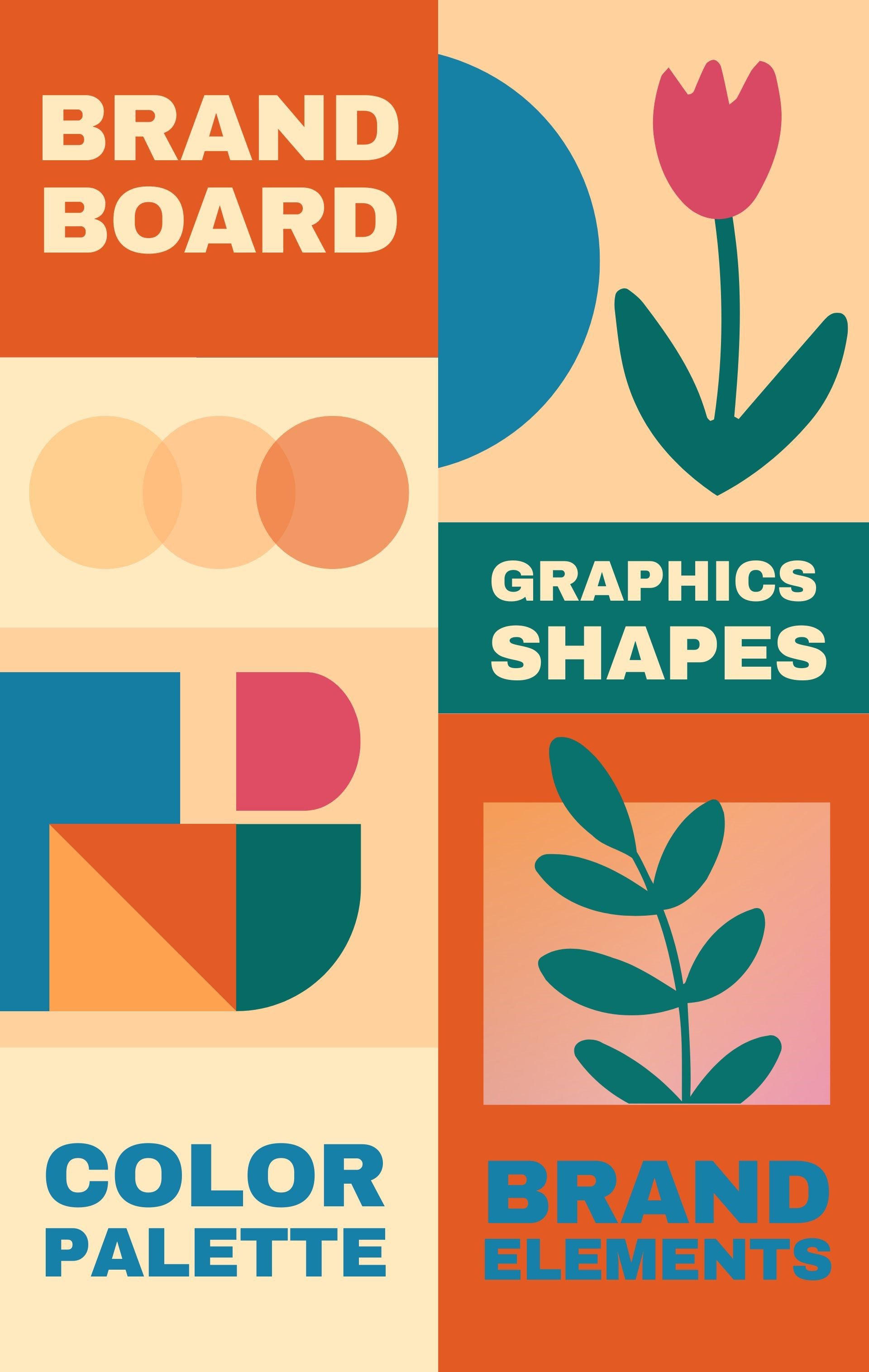
Brand graphics can be as simple as a specific way you crop photos or as complex as a custom icon set. They should feel connected to your logo and color palette while adding flexibility to your visual system.
Netflix uses simple geometric shapes and gradients. Spotify has their signature duotone photo treatments. Mailchimp uses playful illustrations. These elements become visual cues that help people recognize the brand even when the logo isn’t present.
Packaging
If you sell physical products, packaging is a crucial part of your brand identity. It’s often the first physical touchpoint customers have with your brand, and it needs to work both functionally and visually.

Your packaging should reflect all the other elements of your visual identity. This includes your colors, fonts, imagery style, and brand graphics, which should all come together cohesively. But packaging also needs to be practical, cost-effective, and appropriate for your distribution channels.
Consider the unboxing experience too. How does it feel to receive and open your product? Brands like Apple and Glossier have turned packaging into part of the product experience itself, creating moments worth sharing on social media.
How to create a brand identity step by step
Creating a brand identity requires research, strategy, and design working together. Skip any step, and you’ll end up with something that looks pretty but doesn’t work.
Step 1: Research your target audience and competitors
Before you pick colors or design logos, you need to understand who you’re talking to and who you’re competing against. Your brand identity should appeal to your target audience while standing out from the competition.
Study your audience’s visual preferences. What brands do they already love? What aesthetics appeal to them on social media? Look at their Pinterest boards, their favorite apps, and the brands they tag in stories. As you completely commit to your Joe Goldberg act, remember you’re looking for patterns and preferences. Take notes!
Next, scope out your competitors. What colors is everyone using? What styles feel overdone? Where are the visual gaps you could fill? What you’re doing is not looking to copy anyone but identifying white space where your brand can own something unique.
Creating a brand identity becomes much easier when you know what resonates with your people and what makes competitors forgettable.
Social Media Analytics
Fine-tune your social media strategy for success with in-depth analytics and white-labeled reports.
Get Started for FREE
Step 2: Define your brand strategy and positioning
This step isn’t visual, but it’s crucial for making good visual decisions later. You need clarity on your brand’s mission, values, personality, and position in the market before you start designing anything.
Your brand strategy answers the fundamental questions: Why does your business exist? What makes you different? What do you want to be known for? How do you want people to feel when they see your brand?
Every visual choice you make should support your strategic positioning. If you want to be known as the premium option, then your visual identity should look premium, and if you’re the fun, accessible alternative, then your visuals should feel approachable and energetic.
Step 3: Design your visual brand elements
Now comes the fun part. With your strategy and research in place, you can start creating the visual elements that will represent your brand. Start with your logo, then expand to colors, fonts, and supporting elements. If you’re not confident doing it yourself, partnering with a branding agency can help translate your strategy into visuals that truly capture your essence.
Now, you don’t need to pack your entire brand story in your logo, but what you do need is to make it memorable, versatile, and appropriate for your audience. Simple usually wins over complex. Think about the most successful logos: they’re clean, recognizable, and work at any size.
Next, choose colors that align with your brand personality and appeal to your target audience. Develop a primary palette of 2-4 colors, then add secondary colors for accent use. Document the exact color codes so everything stays consistent.
Finally, select fonts that reinforce your brand’s character while staying readable across all applications. Usually, you’ll need a primary font for headlines and a secondary font for body text.
Step 4: Develop brand guidelines and standards
Brand guidelines are your insurance policy against inconsistency. They document exactly how to use your visual elements correctly, which prevents mistakes and makes delegation easier.
Include your logo variations, color codes, font specifications, and examples of how everything looks in practice. Show what to do and what not to do. Give clear rules about logo placement, color usage, and font pairing.
Good guidelines make it easy for anyone on your team (or future team) to create on-brand content without having to guess what looks right.
How to design a brand identity
The actual design process requires balancing creativity with strategy. Every visual choice should serve your brand’s goals and appeal to your audience.
Logo design principles
Your logo is the cornerstone of your visual identity, but it doesn’t need to carry the entire weight of your brand story. A good logo is simple, memorable, versatile, and timeless.
On a side note, in your quest for novelty, do take a moment to think about the story behind your logo. Unless you source your powdered sugar from martians, there’s not much that justifies a donut shop having a rocket in its logo.
Simple logos work better than complex ones because they’re easier to recognize and reproduce. The Nike swoosh doesn’t necessarily explain athletic performance or motivation, but it became meaningful through consistent use and great products.
Test your logo at different sizes and in different contexts. It should work as a tiny social media avatar and as a large storefront sign. Make sure it looks good in color and in black and white.
Avoid trendy design elements that will look dated in a few years. Your logo should feel fresh enough to be current but timeless enough to last at least 5-10 years without major updates.
Color psychology in branding
Choose colors that align with your brand personality and create the right emotional associations for your audience.
Different colors communicate different things. Blue suggests trust and reliability (think Facebook, Ford, IBM). Red creates energy and urgency (Coca-Cola, Target, Netflix). Green implies growth and nature (Starbucks, Whole Foods, Spotify).
But context matters too. The same color can mean different things in different industries or cultures. Research what colors your competitors use and what your audience expects, then decide whether to match those expectations or deliberately break them.
Create a primary color palette with 2-4 colors that work well together. Then develop secondary colors for accent use. Document the exact color codes (hex, RGB, CMYK) so your colors stay consistent across all applications.
Typography and font selection
Typography communicates personality just as much as colors do. Your font choices should reinforce your brand’s character while maintaining readability across all applications.
Choose fonts that match your brand personality. Serif fonts feel traditional and trustworthy, while sans-serif fonts appear modern and clean. Script fonts, on the other hand, suggest elegance or creativity, while display fonts add personality but should be used sparingly.
Select a primary font for headlines and a secondary font for body text. Make sure both fonts work well together and remain readable at different sizes, and be sure to test them on mobile devices, where most people will actually see your content.
Avoid using too many different fonts. More fonts create visual chaos instead of cohesive brand identity. Consistency and cohesion beat variety when you’re building recognition.
Brand identity vs brand image: Key differences
Brand identity and brand image are related but different concepts that get confused all the time, but understanding the distinction helps you manage both more effectively.
Brand identity is what you create and control: your visual elements, messaging, values, and how you present yourself to the world. It’s your brand’s intended personality and positioning, expressed through design choices.
Brand image is what people actually think about your brand based on their experiences and perceptions. It’s their version of your brand story, which might be different from what you intended.
The goal is alignment. When your brand identity and brand image match, your brand feels authentic and trustworthy. When they don’t match, people feel confused or misled, which kills trust and hurts sales.
You can control your brand identity directly through design and messaging decisions. But brand image requires consistent execution over time, great customer experiences, and sometimes reputation management when things go wrong.
Strong brands regularly audit both their identity and image to ensure they’re telling the same story.
Compile a brand identity template
A brand identity template, also called a brand book, provides structure for documenting your brand decisions and ensuring consistency across all touchpoints.
Your template should include sections for your logo variations and usage rules, complete color palette with specific codes, typography specifications and pairing guidelines, imagery style and photo treatment examples, and application examples showing how everything looks in practice.
Include both the rules and the reasoning behind them. When team members understand why certain decisions were made, they’re more likely to apply the guidelines correctly in new situations.
Keep your template updated as your brand evolves, but avoid making frequent changes. Consistency builds recognition, and recognition builds trust. Changes should be strategic, not just because you got bored with your current look.
Here’s a free brand identity template for you to start with:

Also Read: How to establish social media guidelines for your business?
Successful brand identity examples
Looking at brands that execute identity well helps you understand what works and why. Here are examples across different industries and approaches.
Airbnb
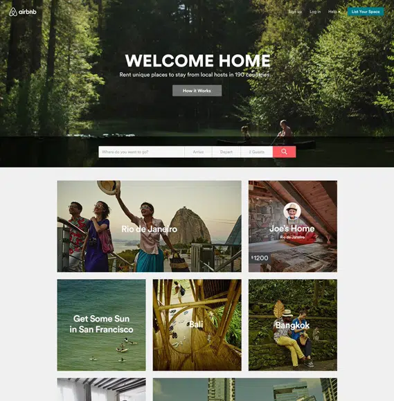
Airbnb created a brand identity around belonging and human connection. Their visual identity feels warm and welcoming, their messaging focuses on experiences over transactions, and their product design reinforces the community aspect of travel.
Glossier
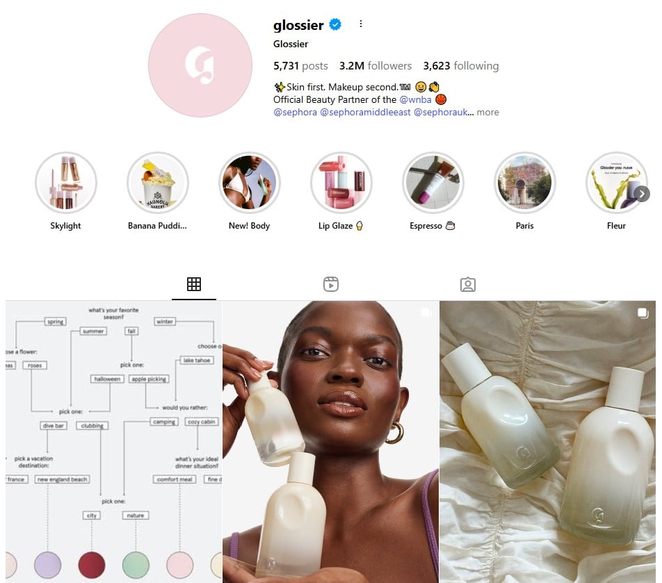
They built their brand identity around real people and authentic beauty. Their millennial pink aesthetic, conversational voice, and user-generated content strategy all reinforce the same message: beauty should feel effortless and inclusive.
Mailchimp
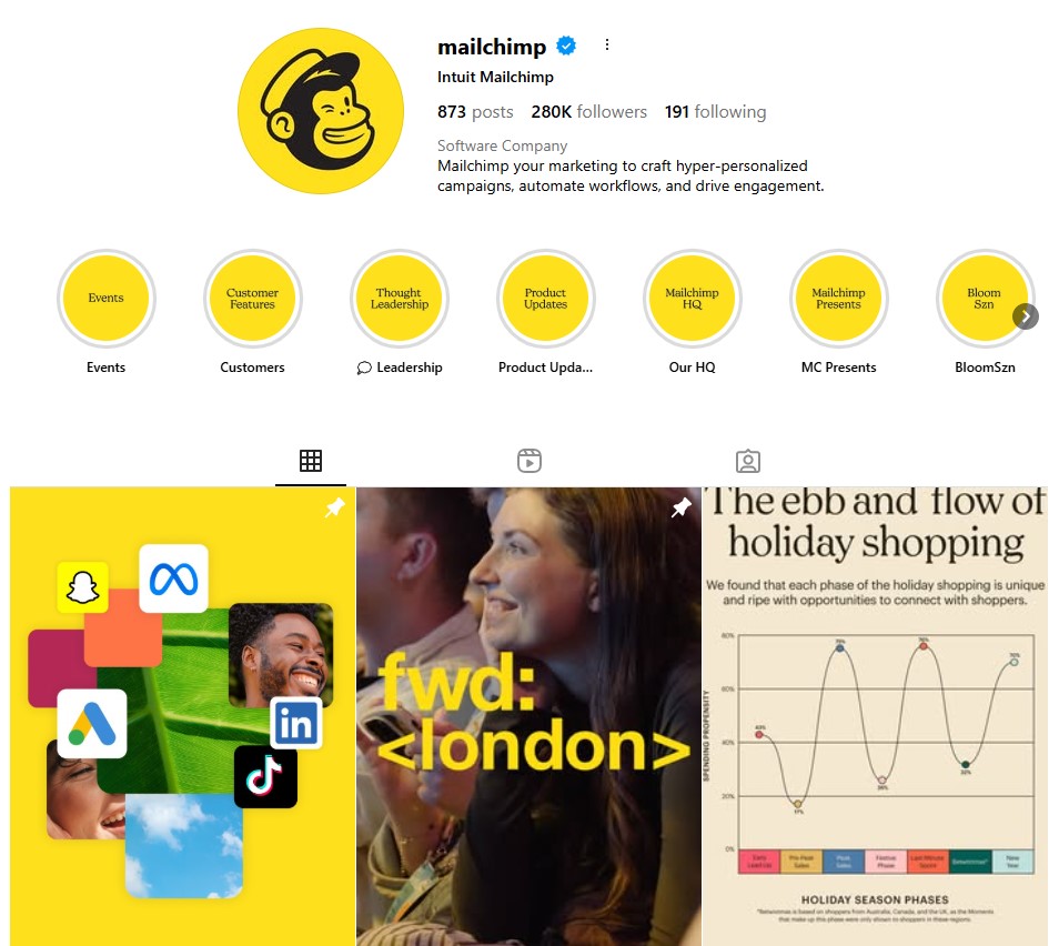
Mailchimp uses playful illustrations and a friendly color palette to make email marketing feel less intimidating. Their visual identity perfectly matches their brand personality—helpful, approachable, and slightly quirky.
Patagonia
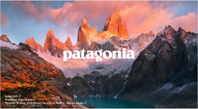
Patagonia aligns every aspect of their brand identity with environmental activism. From their product design to their marketing campaigns to their corporate policies, everything reinforces their commitment to protecting the planet.
These brands succeed because their identity, more than just visual elements, is a complete system that guides every business decision and customer interaction.
Conclusion
The best brand identities feel inevitable once you see them—of course that’s how this brand should look and sound. That feeling comes from strategic thinking, not creative inspiration alone. Start with clarity on your brand strategy, then bring that strategy to life through consistent visual and verbal execution. Test your decisions with real people, document what works, and stay consistent over time.
Your brand identity is an investment in your business’s future. When done well, it becomes a valuable asset that makes everything else easier.
FAQs
What is a brand identity?
Brand identity is the collection of visual, verbal, and strategic elements that represent your business. It includes your logo, colors, typography, voice, messaging, values, and personality working together to create a consistent experience across all touchpoints from your website to your social media to your packaging.
Do I need to have a brand identity?
Yes, every business needs some form of brand identity, even if it’s simple. Without intentional brand identity choices, your business will have an identity anyway, though it might not be the one you want. Taking control of your brand identity helps you attract the right customers and stand out from competitors.
How do I make a brand identity?
Start with research and strategy before moving to design. Understand your audience and competitors, define your brand’s mission and values, and then create visual and verbal elements that support your strategy. Document everything in brand guidelines to ensure consistency.
What’s the difference between brand identity and branding?
Brand identity is what you create and control, i.e., your visual elements, messaging, and strategic positioning. Branding is the broader process of building your brand, including marketing, customer experience, and reputation management. Brand identity is a component of your overall branding efforts.
Recommended for you


Powerful social media management software
7-day free trial - No credit card required.